NUTRITION 262
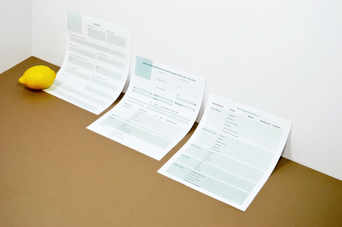
262 Nutrition, Center for Human Development, located in Monterrey N.L, is a center of nutritional counseling and family welfare specializing in diabetes. The customer was looking for a clean and commercial brand, with a universal style that would appeal to all ages and social statuses.

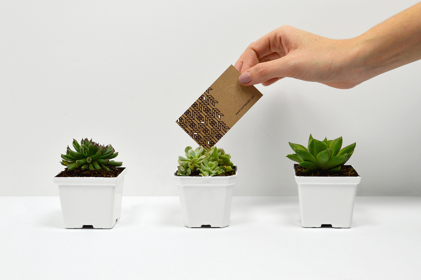
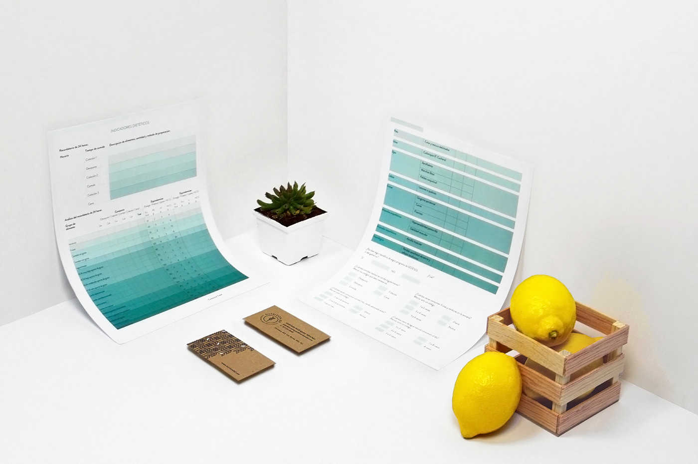
For the color palette we decided to use green, a color that is related to health and good eating, and white, a color that speaks of peace and prosperity. These colors were complemented with a Kraft paper texture for a relatable and organic touch.
The logo and pattern were inspired by an ear of wheat, an item that represents nourishment. This ear of wheat was surrounded by a circle, to represent process and change.
At the end the identity is able to remind us of nature, tranquility and well-being.